Whether you are a mom-and-pop shop or run a large company, you ask the same question: What can I do to make each design look its best? Most designs are not created with embroidery in mind, with details like small type and outlines making for challenging work. Here are a few tips for tackling these obstacles:
Small Lettering
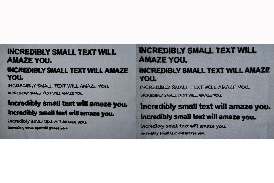
There’s no way of getting around it, at some point in time you are going to have to deal with small lettering. Small lettering is typically lettering less than 1/4 inch. If you have a design that has lettering this small, then you have a few options:
1. Change needle and thread
The industry standard is 40-weight thread and a 75/11 needle. The width of 40-weight thread is approximately .4 mm, which is why the default density of stitches is .4 mm. But with the short height of small letters, this default produces a problem. It means it takes only a few lines to reach the height of the small letters, which can make the lettering look coarse. Even making the letters denser won’t make it look cleaner. First, it will add to the push of the letters, making the letter “I” look longer than the letter “E”. Second, it can cause looping of the thread. Third, it can make holes in the garment. In fact, with smaller lettering, the rule is to make it slightly less dense.
That is where 60- and 70-weight thread comes into play. You should also change the needle to a smaller size. When I digitize for 60-weight thread, I change the density or spacing in the letter. I increase the density about 20 percent. The smaller needles and thread allow you to increase the density with less fear of putting holes in the garment.

2. Run stitches
Instead of satin stitches, try run or manual stitches. It takes some practice to get run stitch lettering to look good, but it can be done. Run stitch lettering is usually a double run stitch in which you start at one point, go to the end and come back on the same stitch. If you can stagger the stitches so the points do not fall on themselves, the lettering will look better. Chose a point that can hide the tie-ins and tie-offs better, such as the cross section of a “T”. Another tip is to make some vertical strokes, such as those in “I”s and “A”s be taller than letters such as “E”s. Because of the vertical grain of fabric, “I”s and “A”s are going to sink. Making them taller will counteract the sinking.
3. Stack Lettering
One of the simpler options is to take one long line and stack it up in two or three lines and enlarge it until it reaches the desired size. I would recommend doing a rough mock up for the customer to look at before going ahead with this type of change.
4. Tone on Tone
What if the customer requests a tagline that is 1/8 inch tall and must be in satin stitch, and you don’t have small needles or thread? Try suggesting the tagline to be tonal (a shade darker or lighter than the garment.) This will make the letters legible, while helping to hide inevitable flaws.
Thin Outlines
I come across a lot of designs that have a ton of thin outlines and detail. While this is just fine for most printing, it won’t work for embroidery. In most cases you won’t be able to use satin stiches so you are limited to run stitches or double run stitches. It is rather difficult to trap fills with run stitches. Look at your design and see if the outlines can be partially or completely dropped. Perhaps use different stitch direction and fill to get the detail rather than rely on outlines.
Too Many Outlines
Excessive outlines can create many complications. For example, when you have two satin stitch lines against each other they tend to interconnect and lose their crispness. If the outlines are wide enough, then you can simply change the underlay to edge run or change the angle of one of the outlines.
There also is a possibility of multiple outlines not looking even. They can move or shift outside or under the next outline. This is going to happen more often with performancewear because of the stretchiness of the fabric, and with hats because of the lack of stability with the hooping frames.
Try reducing the number of outlines, or make them thicker. Thin outlines are going to have a harder time looking clean and even.
Blends
Fill stitches are best for blends, but they have limitations. Fill stitches have more needlepoints, so they don’t work well in narrow thin areas. Add another layer for the second color, and you have even more needlepoints. Also, direction is a concern. One-directional blends work best. Radial blends, although they can be done, are much more difficult to achieve, so I recommend not doing radial blends in most cases.
The better you understand you and your embroiderer’s capabilities, the fewer headaches you will have in the long run. Discuss with your customer how a logo may require some changes for the best possible look. Tell them that small lettering may be an issue and that the fewer outlines the better, and explain some of the alternatives. Letting the customer know the challenges before the fact saves time and money and results in a happier customer.
Jesse Elliott is digitizing product manager for Ignition Drawing, formerly Artwork Source.


