The end of the year is a great time for garment decorating. Halloween, Thanksgiving, Christmas – all are the perfect reason for creating fun, festive designs for printing. With dye sublimation, sales opportunities abound with all the products available to create and resell. Sure, you can create a custom T-shirt layout and simply resize that design to print on other products. But why not change things up a bit? Instead of using the exact same image on everything, use elements from the main T-shirt design and rearrange for a new layout on a different product. Create a line of products using the same elements, but adjusting the layouts to suit the products. Change or remove the type, pull individual elements—these are just a couple of the things you can do to change up the products, but still have a cohesive line for people to purchase, whether it’s for home décor, party supplies or dressing up.
Ghostly Grog Halloween T-shirt Design
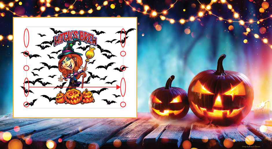
Next to Christmas, Halloween is the time when people go all out–parties, decorations, costumes. It’s a designer’s dream! Use this opportunity to create products for resale or custom products for your party guests, like the straight tumbler layout shown in inset image at the top of this story.
To create this layout, start with a template from your product supplier or take the height and circumference dimensions of your tumbler and set up a new document in Photoshop. Either way make sure you use the proper dimensions, including additional bleed area if needed for your layout. For the top and bottom, a quarter inch is more than enough bleed space. For the sides, if you won’t have anything wrapping around and overlapping where the seam will be, you don’t need to include extra bleed area. Note how in the layout, the elements were placed right up to the sides. If you want to create a seamless wraparound, you can extend the sides and allow pieces to go beyond the tumbler dimensions. Where you extend an element on one side, you want to leave open space on the other so that when you wrap the paper around the tumbler there will be empty space for the element to fall.
When setting up your file, be sure to set up the proper resolution and color profiles. I use 300 ppi, RGB color mode with the Adobe RGB (1998) color profile. I find this creates the best, purest color when creating my layouts resulting in better prints. Also, be sure to set it up with a transparent background.

Figure 1: Note how the ghost image in this design has been offset to the right. Image courtesy of Dane Clement
Once your file is set up, you may instinctively want to put your image in the center and let everything else flow to the sides. There’s no problem with that. But in the case of our second tumbler design, seen in Figure 1, since the main image is on one side and the type is on the other, the positions were shifted so that neither will fall on the sides edges that will form the seam. A guide was placed in the direct center, followed by guides placed in the center on each side. This is where the type and image were placed. Now the type and image will fall on opposite sides as the front and back of the tumbler with the seam on the side.
A few additional images were used to create the final draft of the second tumbler layout, including a spider and some bats. However, the ghost was going to be the main image, so it was copied from its original file as-is and then placed in the layout. It was positioned so the fades on the right side would not be cut off and then reduced enough so that it wouldn’t wrap too far around. If it was too big as it wrapped around the tumbler, you wouldn’t be able to see enough of the full image from one side making it less visually appealing.
Adding More Visual Elements with Photoshop
Once the ghost was put into position, the type was added using some layer styles in colors pulled from the images to make the layout cohesive. Note how the type was placed vertically and centered on the guide on the left side of the layout.
Next, the spider was extracted from the original file using the Quick Selection Tool. This tool allows you to click and drag to make a selection of large areas. As you drag, when you release, the selection will grow to

Figure 2: Photoshop’s Quick Selection tools does not always leave a clean edge. Image courtesy of Dane Clement
include all the areas of similar tone and color and stop when it reaches a different color. If the selection goes beyond an area that you want to include, hold down the Option/Alt Key and drag over the unwanted area. This will deselect those areas. Reducing the size of your brush will help give you more control over the areas that are selected.
Once the selection was completed, the spider was copied and pasted into the tumbler document. Note that
while the Quick Selection Tool is a great option for making selections quickly, it doesn’t always create a clean edge, as can be seen in Figure 2. If you find unwanted areas, use the Eraser Tool with a hard-edge brush to remove those areas you don’t want and smooth out the edges if needed.
Once the spider was cleaned, the Hue/Saturation Adjustment, which is located under the Image Menu > Adjustments, as shown in Figure 3, was used to adjust the color. “Greens” was selected from the Master drop-down menu in the Hue/Saturation window, and the Hue slider was moved until the green in the spider became turquoise, like the color in the ghost image.

Figure 3: “Greens” was selected from the Master drop-down menu in the Hue/Saturation window, and the Hue slider moved until the green in the spider became turquoise, like the color in the ghost image. Image courtesy of Dane Clement
Multiple spiders were then duplicated, resized and positioned around the layout. To create the line of silk coming from each spider, a new layer was created, a thin rectangular selection was made and filled with black. An outer glow of the turquoise color was added using layer style. This layer was duplicated once for each spider, after which each line was positioned under its corresponding spider in the layers panel.
Once all the spiders were done, we added some bats from another layout. Using the pen tool, a path was traced around the bat. This same path was then used to make a selection, after which the bat was copied and pasted into the tumbler document.
Once again, the Hue/Saturation Adjustment was used to change the color of the bat, so that it would blend with the other pieces in the tumbler layout. Specifically, the blues and magentas were adjusted to become a

Figure 4: The hand layer was placed at the top of the list of layers, so that it looks like the ghost is in front of the bat. Image courtesy of Dane Clement
different shade of blue and turquoise. The bat was then duplicated, resized, rotated and positioned in various locations around the layout.
To create a little bit of interest as well as some extra dimension, the different elements were rearranged in the layers panel to fall in front of or behind one another. Since the ghost image is merged with its
background, it was duplicated and the Quick Selection Tool was used to select the area of the ghost’s right hand. The selection was then inverted, and the rest of the image was deleted leaving only the hand on that layer. The hand layer was then placed at the top of the list of layers, so that it looks like the ghost is in front of the bat , as shown in Figure 4.
For the finishing touches, a selection was made of one of the spiders and filled with dark blue on a new layer, with the opacity for the layer set to 20 percent. The layer was then duplicated a few times and repositioned around the layout. The same thing was done for the bat. The bat silhouette was placed around the layout, with the opacity of

Figure 5: The finished design, complete with bats and spiders. Image courtesy of Dane Clement
some of the silhouettes reduced to 10 percent to help push them back a bit further. With so many elements in the layout, using a lower opacity on the silhouettes reduced the busyness of the final layout as shown in Figure 5.
Once completed the layout is ready to print. Make sure to turn off any mask or template layers and save a new, flattened file for printing. Be sure to also keep a layered Photoshop file so you will always have it in case you want to make changes or, in this case, pull elements from it to create a layout for another product–in this case, socks!
A New Look for Custom Sock Decorating
For the socks, the layout created for the tumbler wouldn’t work. The type, in particular, wouldn’t make sense, because the crew socks are long and skinny, in contrast to the rectangular dimensions of the tumbler. The key here is to create a new layout using the same pieces, but in a new way.

Figure 6: Background color and texture for the sock design. Image courtesy of Dane Clement
As with the tumbler, start your layout either with a template from your supplier or by taking measurements of the socks and creating a document of your own. If you want your image to be an all-over print, like the
one we created here, be sure to include a bleed area of at least a quarter of an inch. With soft goods like socks, dimensions can vary from piece to piece, so you want to make sure you have enough bleed area to compensate for any differences.
Once your template file is set up, start adding your background, whether it’s a color, a texture or whatever you want it to be. For this example, the background image shown in Figure 6 was copied from its original file and pasted into the sock template file. It was then duplicated multiple times, moved and rotated to create an all-over pattern. Using a random pattern like this will help camouflage the side seams when printed. When the desired look was achieved, the multiple layers comprising the background texture were merged together. This is so the color can be adjusted later on, after all the other elements are added.
Now you can copy the ghost, spiders and bats from the tumbler layout and paste them into the sock layout. Duplicate, move and resize as needed to create the desired effect. As you do so, make sure the images don’t extend past the side edges of the socks, so they won’t be cut off when printed. For this sock layout, we put

Figure 7: The final sock design. Image courtesy of Dane Clement
the ghost at the bottom of one sock template. This will be the top of the sock, and the ghost will cover the top of the foot area. The other side is the back and bottom of the sock (see Figure 7).
Once all the elements were in place, and since the background is a busy texture making it hard to discern the other elements, the “Colorize” option in the Hue/Saturation window (shown again in Figure 8) was checked making the background monochromatic. When the colorize option is selected the image will automatically default to red unless another color is selected for the foreground swatch color. In this case it was blue. Using the sliders, the image was darkened and saturated, and the hue was shifted slightly, so that the overall background was darker pushing it back so the elements now pop. Drop shadows were also added to the bats and spiders using layer styles to help them pop off the background a bit more as well.
As with the tumbler, once your layout is done, be sure to save your layered file, not only in case you need to make changes later on, but in case you need it again to create more socks in the future.
The lesson here is, don’t be trapped by a single idea or design. Once you have an initial layout, mix it up to create new layouts using the same elements. Dye sublimation is perfect for this because of all the product options out there. Displaying a line of goods with cohesive imagery but different layouts is more interesting than seeing the exact same layout resized. Think of Halloween parties with coasters, koozies, drinkware and more, all using the same elements but done in different layouts. The ideas are endless and a perfect way to drum up those holiday sales!
Dane Clement is president of Great Dane Graphics, as well as vice president of creative for GroupeSTAHL. He has been speaking and writing for the decorated-apparel industry since 1987. He has authored several artwork-training books for various garment-decoration methods.
Updated Sept. 12, 20204


