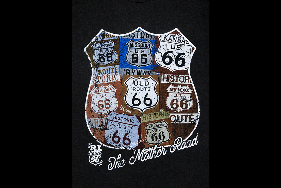
Cruising into spring, this month’s featured design captures the historic spirit of one of the country’s most famous highways: Route 66. Dubbed “The Mother Road,” the design helms from Missouri-based Crackerjack Shack. Inspired by Route 66’s iconic design, lead graphic designer Jesse Nickles morphed individual photos from RJ’s Route 66, a client that specializes in Route 66 photography.
Created in house, Nickles used Adobe Photoshop and Separation Studio to generate the separations. An array of Rutland inks was selected, including Underbase, Matte Black, Sim Red, Sim Blue, Sim Gold and Top White. A 305 screen mesh primarily was used with a Riley Hopkins manual screen-printing press.
“Initially, using that many photos of basically the same graphic shape and the same color family was a challenge,” says Sandy Higgins, Crackerjack Shack CEO. “This is where having a talented graphic artist on staff really pays off. Jesse was able to play around with the images until he came up with the winning arrangement.”
Each sign’s worn appearance was achieved via a collaboration between RJ’s Route 66 and Nickles. Although some of the distressing is original to the signs in the photo, Crackerjack Shack went through a series of distressing layers until the envisioned look came to life.
“Jesse has a bachelor’s degree in graphic design and great proficiency with Photoshop,” Higgins says. “He also collaborates with our production manager, Garrick Hayes, as he’s designing, so we are confident the design he is creating will translate well to screens in the darkroom and at press. It’s through years of working together and years of experience in design and production that these projects really come together.” — Dustin Shrader


