Clothing trends are cyclical; the popularity of certain concepts ebbs and flows all the time. Such is the current situation with tie-dye. People usually have a love-hate relationship with the tackiness of it, but the tie-dye trend currently is on the rise.
Tie-dye garments are fun, funky and send a loud-and-clear message that the wearer is fun and laid back. When you combine the cool concept of tie-dye with a great design and print execution, tie-dyes can be some of the most impressive garments you produce.
However, most of the time, screen printers don’t put a lot of thought into the garment’s design, instead relying on its eye-catching nature. Very little thought goes into the artwork and print production.
It’s important to evaluate what your customers are looking for when they buy tie-dye. The major factor driving the sale of this garment type is the variance from piece to piece and each shirt’s unique characteristic. However, this variation also makes tie-dye more complicated for printing, so you must consider which designs will consistently look good on each unique piece.

Tie-dye garments also present other challenges. Depending on the dye, the ink may migrate. Depending on the manufacturing process, the garment can be very fuzzy. Also, patterns are unpredictable and inconsistent from garment to garment, which can complicate consistent printing. You have to account for all of these factors when deciding how to best approach the print job.
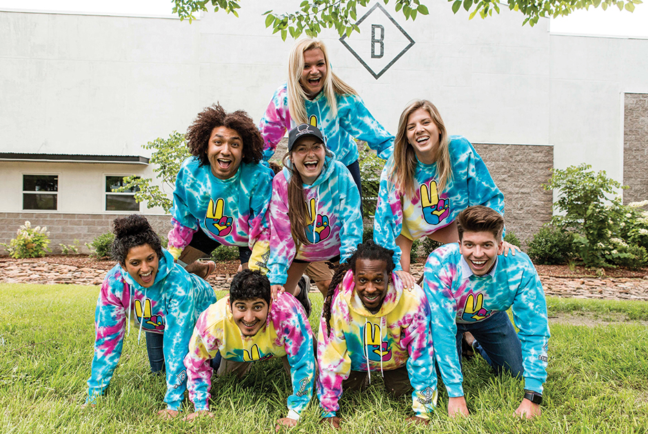
Also, what do you want to accomplish? Think about the color palette first. Do you want a dark rainbow or a more pastel color palette? Are you printing for a wide age range or will the garments only be worn by kids?
Decide on the garment dye, then design around it. If the art is too lightly colored and is meant to be printed onto a light pastel garment, then you will lose large portions of the image. The same applies to dark rainbow or green colors; if the design has dark colors, you will lose it on the shirt.
One simple, but major key is adding a color stroke to the design. For our print on this tie-dye fleece hoodie, we chose a more pastel dye. With that, we had to add a white/black stroke; if we didn’t, it would suffer color-blend loss.
Also, with a stroke, we could print this design on a wide range of different color dyes. One color variant that wouldn’t work is green because of the design colors. We wanted to get a wider range of use with this design — something that both kids and adults would wear.
Follow the process below via the steps shown in the gallery above.
Step 1: Try to avoid the pitfall of printing on a low mesh count so that you lay down a whiter base. Theoretically, you’d use a low mesh count to avoid dye migration, but this doesn’t always work. In fact, it would result in a much worse print. For this particular design, we used Newman mesh panels. When deciding your mesh count, start with one mesh grade higher. Lay down the fibers softly, with as little pressure as possible. A heavy base will result in a heavy print.
Don’t try to achieve a super-bright, white base; instead, an even base should be the goal. The highlight white can help make the colors pop. Use a mid to high mesh count for top coats. This will help with cure times. A light layer of top colors will improve drying time immensely, which will help dye-migration issues.
Step 2: Nearly any ink will work if you use it correctly. We decided to use a hybrid water-based ink for this design. We also added an extra 2% pigment load for the top colors. Once you have established these components, it’s time to print.
Step 3: Here’s a tip when using water-based ink: When you start a job, pre-wet your screens with water. It helps the screen react to the ink better and prevents it from drying in the mesh.
Step 4: We didn’t need to use a dye blocker for this design. We did, however, use our highlight white to make all the colors pop — meaning we basically used two bases. We didn’t use a third top white screen, but we made the base brighter with a highlight white. You also can do this with plastisol if you get a smooth base surface.
I don’t recommend using a low-mesh base and low-mesh highlight white. Instead, I use a high-mesh base and perhaps a low-mesh highlight white — but only if you are uncomfortable with using two high-mesh screens. Be aware of all the variables if you’re going to print fine, soft-hand designs.
Step 5: Top colors were imaged on mesh counts ranging from 166-205. We used a 166 mesh on screens in which we were applying a thicker ink coat. We set them up on a smallest-to-largest coverage order.
Step 6: We printed the base; flashed; printed the highlight white and flashed; and then printed colors with no cooling station. This works well when printing medium- to high-solids water-based inks because there’s less time for the platen to cool between colors.
Step 7: For higher-solids, water-based inks, heat your pallets. This helps the ink dry a little before it goes to the next color. We try to print two to three colors, then flash with no cooling. After the pallets are warm, ensure the flash cures are dialed in, as most dye migration happens during flashing. The goal isn’t to get a complete cure at this stage; you only want the ink to be partially dry to the touch.
Step 8: The same principles apply when printing on the sleeve, with only a few changes. Because it’s a smaller coverage area, we used a base with highlight white. We added the black to help make the design stand out.
Image the screen upside down so that you can put the loose sleeve over the arm in a way that it doesn’t drag. If you don’t have a sleeve platen-sized squeegee, use as little pressure as possible to help prevent bleeding.
Step 9: It’s very important for the printer, assistant and quality-control specialist to have a respectful relationship. The latter ensures the product, which the operator and artist spend so much time perfecting, looks the same from beginning to end. Thus, quality-control staff plays a pivotal role in your business’ success. Don’t take those employees for granted; without them, your customers will get a less-than-stellar product.
Step 10: At the end of the day, you’re creating something fun that people will enjoy wearing. Try to capture that feeling by putting care into the garments you print. After all, the goal is to bring joy to the people wearing them. Your creation probably is an important piece of memorabilia or will mark an important event, experience or milestone for someone. Best of all, it may even wind up being someone’s favorite garment.
Nathan Foster has been in the screen-printing industry for nearly 20 years. He has worked in every aspect of screen printing, from production to sales. He is now the vice president of production at Fayetteville, Arkansas-based B-Unlimited, where he has led a transition from using plastisol to nearly all water-based ink. For more information or to comment on this article, email Nathan at [email protected].


