Wouldn’t it be wonderful if there was a secret formula for designing a best-selling T-shirt for a sports team, a business or for your own pre-print line? Something that if you knew it, would not only give you a head-start on the competition, but allow you to avoid spending countless hours on designs that don’t sell?
Of course, there isn’t any one “secret formula” out there. However, there is a process you can follow that will get you off on the right foot and provide you with much higher odds of success. The process can be broken into two parts: 1) knowing your audience and the trends that relate to what it needs 2) using this research to help create designs that fit its vision.

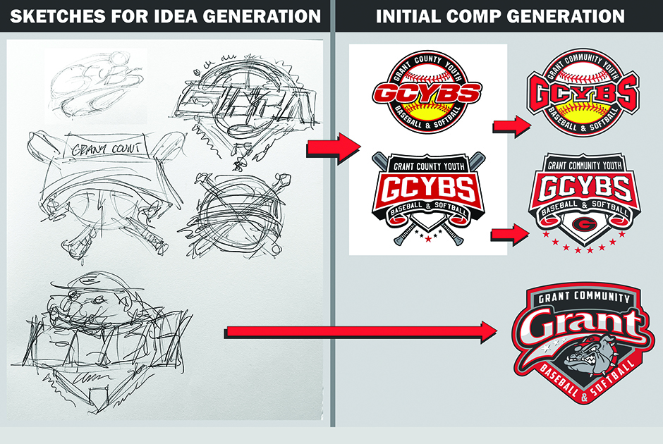
The designs above represent a number of different takes on an attempt to combine an identity function with fashion. Image by Thomas Trimingham
As with any process, there are times a simpler approach will make sense, and the time and detail outlined here won’t be necessary. However, in the case of intentionally creating designs that will sell out or may even become the best-selling designs you have in your product line, it is worth the time and effort to create something more in demand than a quick mockup may produce.
If you have been designing shirts for a long time, you will undoubtedly have examples of situations where a best-selling design was created very quickly and without any research. Sometimes it can seem almost ironic or laughable, when something you spent 10 minutes on outsells designs that may have taken hours. The thing to remember is that good design—and the results that come from it—is never an accident. The hours that preceded the simple design were likely spent creating other designs that took longer. Even if your best-seller is a simple one, it is unlikely it will be repeated in multiple categories. Putting in the time to research, analyze and develop good sourcing and designing habits will pay off with a higher percentage of great selling compositions over the long-term.
The steps for your business to design best-selling shirts may need to be modified from the suggested ones, especially if your audience and the trends that they gravitate toward are unusual in nature. Nonetheless, the main steps still relate, and it is a good idea that whatever process you follow, it should have similar elements to the one suggested here.
Know your audience
It can be surprising for many companies and artists when they take a deeper look at who they are designing for. At first glance, they may think they already have a clear picture of who their audience is and what they like as graphics. With research, however, there often comes a better understanding, with better outcomes from the resulting clarity. The idea is to create a symbolic representation of a typical customer who would eagerly buy what you are creating.
Start out by building a profile using demographic information from your customer list, including age, gender (or genders), interests and lifestyle. Marketing types like to call this your “ideal customer profile,” or ICP. You can also think of this as your customer “avatar.” Depending how deep you want to go you may want to create an image of the “person” and even give them a name. Consider the time spent on this process as being reflective of the investment you are spending on the potential product line you are building.
What is trending with your audience
It is a challenge to stay on top of what may be trending these days. Fortunately, for the majority of this process what you focus on doesn’t have to be the most current or cutting edge. The goal of collecting visual selections of popular images, fonts, designs and media trending with the profile you have created is to create a feel for the essential looks and styles you may want to create. It is about getting ideas and creating a backdrop in your mind as you create. Create a “trend board,” or digital file, to serve as a kind of association mirror and creative well you can draw from.
The things to collect as trends for references will vary depending on the profile of each audience and its interests. If you were assessing trends for say, a sports team logo, it would look a lot different than references for a fashion shirt line.
What is the design’s function
One of the most common reasons T-shirt designs don’t become best-sellers is they lose track of what the design is supposed to accomplish. The trick is to tease this out from your customers’ responses and preferences, profiling your customer trends and typical popular choices. Asking the wrong questions at this point or not focusing on the end user can lead down the road to vanilla designs or worse, having the customer go elsewhere.
The key is to listen and watch. Somewhat ironically, a major challenge is the fact many customers don’t know what they want, but do know what they don’t. Guiding a customer from their initial idea to an idea that sells is an art in and of itself. In practice, a T-shirt design can accomplish a dizzying array of functions. Among these are:
- Identity and unity – a category that can include everything from sports teams to school spirit wear, church groups, companies large and small, or pretty much any other organization
- Fashion and style – designs that will resonate with a group’s particular style or look
- Humor and messaging – some demographics like to use humor to create unique responses from viewers seeing their garments
- Political or social messages – designs that show an affiliation with or support for specific political groups or ideas
- Educational messages – some groups enjoy quotes or other meaningful messages relating to learning and education
- Souvenir and memorabilia – a popular function for those on vacation or visiting a favorite landmark
- Artistic expression – artists may choose T-shirts as their canvas to express artistic visions and creative ideas.
When considering a particular design function, it may become clear the function the customer claims is most important is not what they are actually looking for. A design may also need to serve multiple functions, like a sports logo that identifies a team, but also makes a fashion statement. If you find yourself in a situation where you have to design for multiple functions it is vital you understand which is most important to ensure the design will be properly balanced and reflect both needs.
Initial roughs
Once you have your initial trend and audience research done, it’s time to get designing! Every designer has their own process, but if you can sketch at all, I highly recommend it as a first step. Just put some quick gesture ideas down on paper to see where your mind goes.
The goal at this initial rough, or loose composition stage is to get the general flow of a design together, after which you can tighten up your roughs a step or two before presenting them to anyone else for review. The easiest way to do this is through the use of transparent paper, or for those of you who prefer computers, transparent layers in whatever kind software you’re using.
Once you have an initial design ready for review, go and get some feedback from your customer an/dor maybe a co-worker or two. It is always a good idea to start with several designs, so you have a number to choose from. That way there will be an opportunity to compare and contrast as well as refine or maybe “borrow” part of one design to make help out another.
Note: if drawing just isn’t your thing, you can always go straight into computer aided composition. In this case, I typically start out with a main element and then slowly build around it, saving any variations or spinoffs I may come up with as they develop. If the main element in the design includes some kind of lettering describing a particular identity, working with various fonts early on can be a useful step. On a side note, the reason I prefer drawing as a start is it allows for a level of conceptualization and creativity that is difficult to emulate using graphics only.
Thinking “outside of the box”
As I’m finishing my first set of design comps (either tight pencil roughs or initial computer images) I often find it useful to include at least one “crazy” or completely “out of the box” idea as well. This serves two purposes: 1) it allows you to push the boundaries in a way you might not normally 2) it creates a contrasting design to compare against the original group, thereby allowing you to consider the original group that much more effectively.

An “out of the box” concept, like the one at left, helps put whatever other designs you may have created into perspective. And you never know, it just might be the client’s final choice in the end! Image by Thomas Trimingham
There are many ways to push outside of the lines with an intentionally crazy idea. Some of my favorites include, looking at different designs done for popular movies or in the world of music; finding a design that is somehow unique, has a very different perspective or an unusual placement; intentionally thinking about what the boundaries of your design are and intentionally stretching or even breaking some of them.
Of course, breaking boundaries doesn’t mean creating something rude, offensive or so bizarre the client wonders whether you’ve lost your mind. What you want is to stretch whatever concepts you might already have I mind with an eye toward finding something new. Consistently doing this over the years, I have found that this extra effort, even when not asked for, often creates a sort of fresh energy that, even if it isn’t appreciated in and of itself, will often help push a viewer into making a more informed decision with respect to the other designs on offer—a win-win if ever there was one.
As far as the success rate of this approach, in which the “crazy” idea ends up being chosen over the other, more conservative designs you’ve put together, I’ve found it to be higher than you might think, though probably not more than 25 to 30 percent. I will say that when an out-of-the-box design works, it tends to work extremely well!
The gold is in the iterations
After your first round of comps, you should be able to refine them and finalize your first set of designs for a project. The goal here should be a set of well-designed graphics that resonate with your audience and fit visually with the trends they are currently fans of. Don’t forget to incorporate the garment style and color as you design your final comps. The best-selling shirts of the world are often those in which the design and garment seem made for one another.
Something to be aware of—on occasion one of the very first designs someone creates becomes a bestseller, which can in turn leave them somewhat jaded. They may start to think everything they do is by definition equally great. The truth, though, is that even the best designs can typically be improved on. One of the least appreciated and most valuable exercises an artist can engage in is to review their own work and see what, if anything could have been done better. Dig out those design styles and take another look at them. Do your best to see what, if any patterns are there that seem to be consistently appealing to your customers and how these could be improved on through the use of other graphics.
Some of the most useful questions you might ask yourself include:
- How could this design be easier to print?
- How could this design be more comfortable for the user to wear?
- What could be done for the design to require less ink or materials?
- How can the design be brighter?
- If I look at the design from far away what do I see?
- Is the type in the design easily legible? If not, why?
- When I first look at the design, where do my eyes go?
- How could this design be simpler or more classic?
- Does this design work with the garment color and style, or does it fight against it?
Sometimes the answers to these questions will not actually make the design sell better or worse. However, what they will do is make you a better artist. Reviewing previous designs, both bestsellers and bombs, will make everyone involved in the process of creation and review better. So make sure you and your entire team do so objectively and consistently.
Thomas Trimingham has been helping screen printers for more than 25 years as an industry consultant, artist and high-end separator, and author of over 180 articles. If you have feedback or wish to comment on this article you can reach Thomas at: [email protected].


