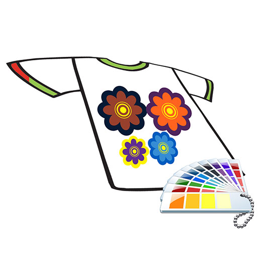
Communicating with a customer or a vendor about printed colors may sound easy at first, but it can actually become a complicated chore without some sort of standard to measure against. Fortunately, there are color books on the market that the printer and customer can use as points of reference.
The most popular color standard used today is the Pantone color system. I have learned through the years that even though you may have a “standard” to compare against, there are still many pitfalls and derailments associated with color communication. Here are some considerations when communicating about color:
Pantone or Color Books
Let’s start out with the standard measuring tool itself. When visiting printing shops, I have often observed that their color books need some serious updating. Some color books are so torn and smeared with ink that the original color is barely visible. Do yourself and your customers a favor: Replace your color books regularly. The colors contained therein can fade over time due to sunlight exposure and just age.
“New” colors also sometimes are added. If a customer asks for a new color, having an updated color book will obviously help in identifying it.
Also — and this seems like a no-brainer — make sure the customer is using the same color book brand that you use. For example, Pantone does have coated and uncoated color books, and there are other branded standard color books available.
Viewing Light
An often-overlooked part of color communication is lighting. Colors look different in different lights, so when communicating about color, be sure to mention the light you are using. For example, if you are looking at your color book in daylight, but your customer is viewing it under fluorescent light, the color will look different.
Computer Screens
Different computer screens vary in resolution and color output. Hence, make sure you don’t match a color based on what it looks like on someone’s computer screen. Get a standard color book to ensure everyone is on the same page.
Inks
Translating color to inks also requires some considerations. For example, when matching a color using plastisol inks, remember that the finished print can either be glossy or matte, depending on the ink. However, when using a water-based ink, the finished print will usually be matte. Also, be aware that color can shift — albeit slightly — and look different from the original depending on the ink type used.
Substrate Color
Next, consider the color of the substrate being printed. When printing on a white shirt, the matched color may look pretty close to the original. But what about when it’s a darker or black shirt? Some adjustments may need to be made, or a white underbase may be needed, to ensure the printed color comes close to the original.
One important final point regarding color is the temperature factor: Some dyes may look different when they are heated or while they are still in a heated stage. For example, some red pigments will appear darker when heated, so look at the print after it has cooled to ensure it matches the original on the color chart.
Kieth Stevens is the Western regional sales manager for International Coatings. He has been teaching screen printing for more than 10 years and is a regular contributor to International Coatings’ blogs. For more information, visit iccink.com and read the company’s blog at internationalcoatingsblog.com.


