
Avoiding problems early on in your color separations will cascade down into gains at every step of the screen-printing process. Fewer screens, for example, will need to be recreated to accommodate last-minute changes. There also will be less press downtime and savings in the ink department, as less inks will need to be adjusted or remixed. Lastly, your customers will be much more satisfied when the final print appears to match their original design.
To avoid separation headaches, the key is having a functional strategy in place to properly prepare your artwork in advance of pulling out the colors. Keeping this in mind, a plan that will greatly simplify and streamline your separations includes the use of three simple processes to avoid a lot of the common headaches that most companies face: adjusting the artwork for ideal resolution, correcting edge quality issues, and combining colors for a nice, bright printed image that is also printing friendly. These three “pre-separation” steps comprise a methodology, or series of techniques, that can save hours of time if properly adopted. The goal is to make your art separation-friendly before you even start to separate it.
The reason many printing companies don’t adjust artwork before they begin to separate is they don’t want to spend the time. The thinking is, “Why would I spend extra time when I can just get right to the separation steps and get it on screen?” The problem with this approach is that it fails to address the myriad potential image issues that may exist prior to starting your separations. This in turn means you will be separating the problems in an image at the same time you are trying to separate the art elements. Any extra pixels, color pollution in flat colors, fuzzy outline edges or multiple hues that shift in different image areas will not only create additional challenges during the separation process, they can cause the final printed product to be unacceptable.
True, customers often do not want to pay for these kinds of image retouching and refinement steps outside of separations. It is a fair question on complex jobs whether to attempt to charge the customer, or whether the time savings and higher success rate on press will make it worthwhile. The irony, as many printers soon learn, is that by taking the necessary preparation steps early on—even in those cases where a client is refusing to pay for them—the resulting setup and subsequent printing will often be so much faster and easier it is more than worth the effort, regardless of client approval.

As President Abraham Lincoln famously said, “If I only had an hour to chop down a tree, I would spend the first 45 minutes sharpening my axe.” In this same vein, spending the first portion of your separation time addressing the integrity of the artwork and adjusting the resolution, the edges and colors, will make things that much easier during the actual separation process.
Techniques for Ensuring Ideal Resolution
Images come into screen-printing shops in an amazing variety of resolutions. Screen captures from web pages, fuzzy enlarged business card logos and many other methods can create havoc when it is time to separate a supplied graphic. The first step is therefore to see what the actual resolution of the image is. In Photoshop you access this through the image/image size dialog box.
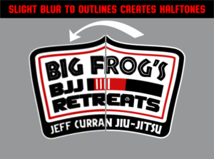
Even a slightly blurry edge, like the one at right, can create halftone problems.
A good rule of thumb in screen printing is to ensure the resolution of the source file is at least four times the output of the final lines per inch, or lpi, of the halftone dots you plan on burning on the screen. A 55 lpi halftone dot, for example, would indicate a minimum file resolution of 220 dots per inch, or dpi. As a rule of thumb, a 300-dpi image will be good enough for most artwork, unless it is incredibly detailed or you plan on using an unusually high halftone dot count when printing.
Next you need to look at the flat colors, as well as the shapes and edges in an image to see if there is any pixel distortion indicating the image may have been enlarged or otherwise damaged during resizing. Sometimes a supplied graphic can start as a low-res web capture that is then resampled at a larger size for printing, in which case simply having enough pixels per inch doesn’t necessarily make the graphic usable.
If your source file’s resolution isn’t high enough, your best option is to contact the client and ask for a better file. You can then attempt to resample whatever else they may send you and see how it affects the image quality. If the client doesn’t have a better image and resampling doesn’t work, your next best option is to suggest to the client that the file will have to be recreated, that or let them know that the final print will is going to be of lower quality due to the poor resolution.
Correcting Edge-Quality Issues in your Screen Printing
For some reason, screen prints tend to call attention to images with edge problems. This is especially the case where resolution isn’t enough to create a smooth line, or if there is a bit of distortion where the graphic becomes blurry. In either case, the final screen print will often make these issues look even harsher.
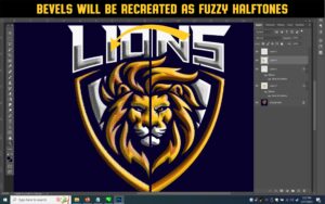
Bevels, like those at right, can also be a source of problems.
Edge-quality issues can also result with an image that includes a drop shadow behind a graphic. The effect may appear subtle on a computer screen, but when printed becomes a kind of speckled ghost that damages image clarity. Other times a graphic may have an effect that has been applied to the inside of the shapes in the image (an easy thing to do with filters in Illustrator or Photoshop) that causes the final image to appear dimensional or beveled, in which case it will have to be recreated using dots that can appear grainy or fuzzy as well.
In the event you find a problem, the next question is whether it is serious enough to warrant editing the source file. In the case of image effects, filters or drop shadows, it can be hard to know if the edges in the design’s shapes will be damaged or somehow look less appealing until the halftone conversion is done. Often an educated guess can be made as to whether an area that must maintain a smooth edge is relatively small vs. the number of halftone dots needed to recreate it. This is commonly the case with, say, a design that might be smaller than 4 inches square and has beveled effects on it or a drop shadow. With a design of this size, there just aren’t enough dots to create an appealing illusion of a smooth shape, and it will likely need to be adjusted.
The way to adjust edge issues typically fall into three groups: resample and clean up/remove extra pixels; add extra colors or flatten shapes with fades or effects; or complete recreation to revise the entire image.
Combining Colors to Simplify Images
A close inspection of an image can reveal a host of challenges with colored areas that can greatly benefit from art preparation work prior to color separation. The things to look for are “color pollution,” in which a seemingly flat color has speckles of many colors in it, or a shape in the design that may show reflections of other colors, like chrome or water. You may also encounter issues with colors in your source artwork that can be thought of as “memory colors,” i.e., colors that appear unnatural to the human eye if printed with an even slightly wrong color and can cause an entire print order to be rejected. Examples of memory colors include skin tones, grass, water, sky, wood, chrome and other items that we can instinctively tell whether they are a natural looking or not.
The mix of hues in the original image below will likely result in serious “color pollution;” combining these colors, as was done with the pair of images above, will go a long way to solving the problem. Photo courtesy of Freepik.com
The first step in recognizing a problem in a source file is to look for any areas containing memory colors or any possible color pollution and see if there are a lot of different color hues in these areas. Once you have noticed an issue, it will be up to your company policy whether you address this with the customer or not. Combining colors is occasionally done without letting the customer know (assuming the final image will not be negatively impacted), for the simple fact it has the dual effect of making printing production a lot easier and can additionally save screens, colors and inks.
The process of combining colors can be easiest in software such as Photoshop with the process usually taking place in three simple steps. The first step is to create a selection or mask in the program to select only those areas that contain the colors you need to edit. Selections such as this are usually the most time-consuming part of the process and require experience to do 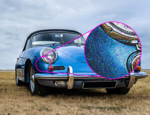 quickly so valuable time isn’t lost in slow painting or drawing around the shapes in an image.
Once the selections have been made, the second step is to create an additional layer or channel from your selection that will allow you to apply a color correction to the defined areas. The reason to do this is that if you have to go back to the original you won’t lose your selection, or the original graphic, and you will only be editing it as an additional shape rather than a replacement.
The final step in the process is to edit the colors within the selection to all fit the same hue. This can be done using the “colorize” command or by applying a color filter effect in a mask. Once you see how the adjustment affects the original it can be optimized with the help of other controls, such as opacity or blending.
It takes experience to properly prep a file for color separation, but once the processes are practiced on a regular basis, they become easier and faster to do. It is also important to note that using these preparation methods on images will reap benefits no matter what method you use to separate; manual, with separation software, or if you send the file out to color separation service. The results from image preparation are significant and will be greatly appreciated by the printing team when every image has a higher on-press success rate, less colors per print, and the final prints look better for the customers.
Thomas Trimingham has been working with screen printers for more than 25 years as an industry consultant, artist, marketing professional and author of over 180 articles. If you have feedback or wish to comment on this article you can reach Thomas at [email protected]. This story updated on April 27, 2023.


