Why Artwork Setup Matters in Apparel Decoration
In the garment-decorating industry there are many different production methods available–screen printing, direct-to-garment (DTG) printing, dye sublimation, direct-to-film (DTF) transfers, vinyl cutting and more. Each method in turn often requires a specific type of artwork or have certain specifications that need to be met in order for the image to be reproduced properly and get the best print. When you’re new to the industry this can be very confusing. Having a better understanding of some of the basic art principles and requirements will help you create your artwork correctly, so you won’t run into headaches during production.
Vector vs. Raster Artwork: Choosing the Right File Type
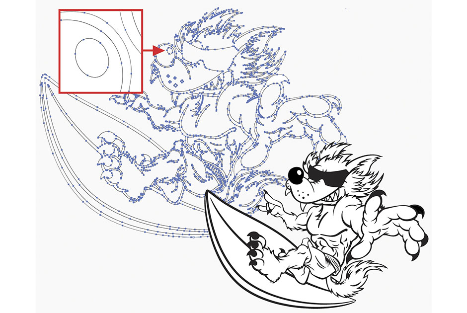
First and foremost, there are two main types of artwork employed in the world of decorated apparel: vector and raster. Vector artwork tends to be more commonly used, especially for newcomers to the industry. It is made up of a series of points and paths creating lines and shapes that can be filled and/or outlined with color to create your design. Software like Adobe Illustrator, CorelDRAW and Affinity Designer are the more commonly used vector-based programs.
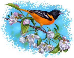
Raster designs are made up of small dots called pixels to create a continuous tonal image. Photo courtesy of Dane Clement
Raster artwork, on the other hand, is made up of small dots called pixels that create a continuous tonal image. You may also hear it referred to as bitmap artwork. If you zoom into a raster image, you’ll notice the small colored dots that make up the image. Photographs are an example of raster artwork. Some of the more commonly used raster programs include Adobe Photoshop, Corel PHOTO-PAINT and Affinity Photo.
Certain decorating methods require vector art. Software used for vinyl cutting, for example, requires vector files, because it reads the file’s various paths and points to tell the cutter where to cut. This includes full-color print-cut vinyl images, which can be printed as raster images, but require a vector path for cutting afterward.

Screen printing can use either vector or raster artwork, though for people just starting out, vector artwork tends to be the type of choice. The more colors involved, the more a screen-printed image will cost to produce, so beginners will typically use vector art with one to three colors. Raster images can be printed in just a few colors as well. A full-color raster image can also be turned into a grayscale image and printed as a one-color design.
Vector images that include gradients and tints of colors can be reproduced through the use of halftones, i.e., small dots lined up in rows like those associated with newsprint. Raster artwork, because it is normally made up of continuous color as opposed to solid areas of color, is generally reproduced using halftones as well. In either case, having and knowing how to use the software and tools to separate your image and print film positives or go direct to screen with the proper sized halftones is essential for getting a good print.
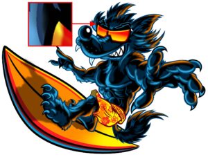
Note how the letters in this image have been textured to help mitigate the effects of banding or streaking. Photo courtesy of Dane Clement
Like screen printing, digital printing can employ either vector or raster artwork. This includes dye sublimation, direct-to-garment printing, white-toner transfers and direct-to-film transfers. While vector art can be used, because digital printing has the ability to print full color without it affecting price, as is the case with screen printing, it only makes sense to utilize the full-color potential of raster artwork.
Note, an issue with digital printing can be banding or streaking, i.e., when lines appear in a print as a result of a print head becoming clogged. Because banding is more noticeable in areas of solid color, vector images tend to fall victim to this problem more than raster images. Because raster artwork is generally made up of multiple varying colors, even if some of the nozzles are clogged, the other colors will still print, which helps camouflage the banding. Incorporating things like gradients and textures into large solid areas will further reduce the chance of noticeable banding.
Designing for Direct-to-Garment (DTG) Printing
Regardless of whether you use vector or raster artwork, each decorating method will have its own specifications or restrictions to consider, with DTG printing being the most lenient. Again, with DTG cost is not affected by the number of colors the way it is with screen printing. DTG also doesn’t produce an image with a “heavy hand,” i.e., a stiff plastic feel, so you don’t need to worry about trying to incorporate gaps or openings in the artwork to reduce the amount of material being applied to a garment the way you might with transfers.
When employing the dye sublimation method, it’s important to keep in mind the color of the garment on which you will be printing. Photo courtesy of Dane Clement
Other benefits of DTG include not having to worry about soft faded edges and the fact you can print on any color shirt, since you can print white ink. In general, if you start your image at the proper size and resolution you can pretty much design anything you like. The only thing to keep in mind is avoiding large solid areas of color as mentioned earlier to help camouflage any banding issues that might arise.
Designing for Dye Sublimation
As is the case with DTG, dye sublimation is pretty easygoing in terms of restrictions. Other than solid areas of color, the only thing you need to keep in mind is that you can’t print white ink the way you can with DTG. So, while you are still pretty free with how you design your layout, keep in mind it will need to go on a white or light garment to ensure the image will be visible and white areas in the image will remain white.
Designing for Direct-to-Film (DTF) and White-Toner Transfers
Moving on to digital transfers, like DTF transfers or white toner transfers, these allow you to print in full color and white. However, these two methods can also be heavy handed and faded edges can be troublesome.
To help reduce the hand, or feel, of a DTF transfer, incorporate cavities or openings throughout the design. Otherwise, the transfer can feel heavy, hot and uncomfortable when worn. By creating a layout that incorporates free-flowing space and gaps in the image, less material will be printed and pressed onto the shirt, making it both more breathable and more comfortable.
Note that to produce DTF or white-toner transfers, the colored inks are printed first. After that, with white-toner transfers the color print is pressed to a second sheet with a white adhesive that sticks to the printed inks; similarly with DTF white ink is printed on top of the colored ink after which an adhesive powder is applied.
The textured edge shown here is an example of an alternative to a more subtly graded faded edge. Photo courtesy of Dane Clement
Either way, in both cases all areas of the image need to be large enough for the adhesive to adhere to. For this reason, there are minimum sizing specifications that need to be followed to make sure the entire image transfers to the shirt and sticks after washing. Check with your production house or printer manufacturer if you are printing internally to see what minimum size they recommend. Any dot or line smaller or thinner than the recommended minimum may not provide enough area for the adhesive to bind too and will therefore peel off—if it transfers at all.
Another thing to consider when creating DTF or white-toner transfers is edging. Generally, soft faded edges do not transfer well, and you run the risk of them looking uneven or splotchy. To prevent this, the most obvious option is to simply create a design with a hard edge. As an alternative, try using interesting shapes with textured edges that meet the minimum specifications and then paste your image with the faded edge inside. Another option would be to apply a large halftone screen to the faded areas. While the result might not be exactly the same, you can still get a faded effect with a cool, graphic look.
Designing for Vinyl Cutting and Heat Transfer Vinyl (HTV)
In the same way digital transfers have minimum size specifications and benefit from open spaces, vinyl cutting also has size and space limitations. Not only is heat-transfer vinyl a thick material, some specialty vinyls, like glitter flake and flock, are even thicker. You therefore want to be sure and incorporate plenty of openings in the image. For specialty vinyl you want enough material to show in your design to get the full effect that it provides, but not so much that the print is uncomfortable.

Gauging the width of the elements making up a heat-transfer-vinyl design. Photo courtesy of Dane Clement
No matter what the exact type of vinyl, specifications for line thickness and spacing will affect your design process. Lines need to be thick enough so that when the image is cut and weeded, they don’t break. Thicker lines also help make the production process go quicker. I like to create a circle the size of the minimum requirement, usually about 0.06 inch, and then move it around my design to make sure all of my lines are at least that thickness or more. The thickness you use will be determined by your production house if you are outsourcing. Check with them to see what they require and create your design accordingly. Otherwise, your image may be kicked back, or you may be charged an art fee if they need to make changes.
If you are doing the work in-house, you may have more leeway depending on how many images you have to produce and how much time you want to spend cutting and weeding. Remember, time is money, so you want something that is going to cut and weed as quickly and easily as possible.
Same thing when incorporating cavities into your image. The more cavities, the longer it will take to weed. If you can join multiple areas together that can be weeded in one pull, it will make the process quicker. Something else to consider when creating artwork for vinyl cutting is staying away from long skinny points and rounding off sharp tips. Long skinny points will roll up when weeding, forcing you to slow down or causing them to pop up and ruin your garment when pressed. Rounding sharp tips will make cutting smoother and quicker.
Designing for Screen Printing
In contrast to vinyl transfers and the various digital decorating methods we’ve been discussing, screen printing is a completely different animal in that the process of going from artwork to final print is much more involved. That said, the artwork itself is similar to DTG in that there really aren’t any restrictions or specifications that you need to follow or incorporate. For example, the fact you can print a base white allows you to print on any color shirt. You also don’t have to be concerned about faded edges, the way you do with transfers. Nor do you need to worry about size requirements or cavities, as is the case with vinyl cutting.
Note that when separated raster artwork has a lighter feel to it, because the separations, including the base white, are made up of halftones. If, on the other hand, you use a vector image for screen printing and it doesn’t have a lot of spacing or black throughout the image, the base white can become overly solid, causing it to feel heavy or “bulletproof.” To help mitigate this effect, if an image has black incorporated in it, try breaking up the white base to make the printed image feel lighter, since white ink is unnecessary under black ink anyway.
When creating vector artwork for screen printing, it’s also a good idea to think about how you will be creating your separations and the type of registration you’re planning on using–butt, trap or gap. Do you need to add strokes to your paths? What will need to be overprinted? Are your colors set up as spot colors so you don’t have to go back and reapply them later on? How will you set up your base white? Will you need to choke any colors or areas? Keeping these kinds of things in mind from the beginning will make it that much quicker and easier when it comes time to create your separated files for production.
Dane Clement is president of Great Dane Graphics, as well as vice president of creative for GroupeSTAHL. He has been speaking and writing for the decorated-apparel industry since 1987. He has authored several artwork-training books for various garment-decoration methods. For more information or to comment on this article, email Dane at [email protected].
This article was updated on Sept. 30, 2025.


