Direct-to-film, or DTF, is making waves in the world of garment decoration. Unlike methods such as screen printing, direct-to-garment (DTG) or vinyl cutting, DTF doesn’t require messy screens, pretreatments or weeding. Benefits like these along with the ability to print full-color images and small details are just a part of the reason DTF has grown rapidly over the years. With that being said, to take advantage of this process to its fullest, you need to know how to create and set up your artwork properly.
Working With Faded Edges
When creating your designs for DTF transfers, one of the biggest issues you need to be mindful of is faded edges or transparent areas. The reason for this is that after the image is printed from an inkjet printer, an adhesive powder is applied to the ink, which helps the transfer stick to the fabric. As a result, with DTF transfers the ink droplets or tiny spots used to produce faded edges and transparent areas are too small, so the powder doesn’t have enough surface to cling to. They may, therefore, not adhere properly or could peel over time, leaving rough, splotchy areas. To prevent this, there are a few different options you can utilize when creating your art from scratch or adjusting a design you may already have to make it work.

The easiest way to avoid faded edges is to create a path around the edge of the main element with the pen tool (see below) and delete the unwanted faded areas. Image courtesy of Dane Clement
Hard Edges – The simplest way to avoid printing faded edges is to create a solid image with a clean, hard outer edge. If you already have a design that has a faded edge, you can easily fix this by using a selection tool like the pen tool. Create a path around the edge of the main element or area that you want to keep with the pen tool, then make a selection of the path, invert the selection and delete the unwanted faded areas. Now you can use the image in a layout with no worries.
Using Shapes – Another handy trick to avoid faded edges is to place your image inside a shape with a clean, hard edge. You can use basic shapes like circles or rectangles, but try thinking outside the box as well. Try pasting the image inside of text or create unique freeform shapes using the pen tool or any other tools like a hard-edge paint brush. Create a shape that complements your image or layout idea. For example, if you are creating an image for a swim team or a fishing design or something with a water-related theme, make a giant splash shape. It will create a much more intriguing, eye-catching design.
Large Halftone Dots – Among the advantages of DTF transfers is the ability to print small details. It is this advantage that provides the next option for dealing with faded edges to work. In fact, the use of large halftone dots has become very popular with DTF transfers, as it allows you to keep the integrity of the design instead of needing to eliminate areas and sacrifice the original look.

Once the path has been created, you can make a selection, invert and delete the unwanted faded areas. Image courtesy of Dane Clement
If you have a raster design with faded edges, start by making a selection of the original image. When using Photoshop, you can do this by holding down the Command/Control key and then clicking on the art layer. You should see “marching ants” running around the perimeter of the image denoting the fact it has been selected. Make a new layer and fill the selection with black. Duplicate the file so you have two separate files available. The new file will be used to create the halftone.
In the Menu Bar, go to Mode > Grayscale. Turn off all the layers except the layer with the black faded shape. Go back to the Menu Bar > Mode and select Bitmap, where you will be prompted to flatten your image. In the first window that pops up, make sure the resolution matches the resolution of your image. (I always set up my images at 300 ppi.) Click OK, and in the next window set up the halftone specifications.
For the frequency, the smaller the number the larger the dot. The larger the dot, the more “graphic” the image will look. I recommend a frequency of 20 lpi. For the angle, I use 61 degrees and a dot shape that is either round or ellipse. Round dots will give a more traditional, graphic look to your image, while elliptical dots will look more organic and provide more surface area to adhere to the garment. The look you want the final product to have can help dictate the dot shape you’re ultimately going to want to use.
Once the halftone screen is set, change the mode back to grayscale. Now you need to transfer this halftoned greyscale image to the original layered art file. To do this, click on the tab at the top of the window for the grayscale file and drag it out of the window to separate the files into two separate windows. Now you can go to the channels panel of the grayscale file and drag it to the art file. It will automatically create a new channel in the art file with the halftone in it.
That done, hold down the Command/Control Key, click on the halftone channel and go back to the layers and make a new layer. Fill the selection with a color that will work with your image. It can be black, white, gray, a neutral color or even something that will match the shirt color the image is going to be applied to. The reason for this is you need these dots to be solid to adhere to the shirt. By filling the selection with a color, it acts as a backing color to fill the dot so the halftones will be solid and have enough area for the adhesive powder to stick. Once the color is filled into the selection, make sure the art layer is above the halftone layer. Hold down the Option/Alt key and click between the two layers. The art layer will automatically be pasted inside the halftone layer. Viola! Your original image with the faded edges now has a halftoned edge.
Note that while DTF transfer can hold small details, there remains a limit as to how small you can go. Check your printer for its specifications and then use that measurement to determine what dots may be too small to hold. Erase those that are too small so you are only left with printable dots.
There are two tricks I use to help determine and eliminate dots that are too small. First I make a new layer, and use the Elliptical Marquee Tool to make a round selection at the smallest size recommendation from my printer. Fill the dot with a bright color that will stand out from the image. You can then move the dot around to see what dots need to be removed.
Another quick way to remove several small dots at once is to make a selection of the halftoned artwork. Contract the selection 2 pixels and then expand the selection 2 pixels. Invert the selection and delete. This will automatically delete any dots smaller than 2 pixels. Depending on the size of the dot you can hold, you may need to increase or decrease the amount of pixel contraction and expansion.
You may still need to double check using the small reference dot, but this will help remove a lot of unprintable dots at once so that you’re not wasting time manually checking and erasing.

Although today’s DTF transfers have a lighter feel than in year’s past, it’s still a good practice to include some open spaces in your design where the garment can show through. Image courtesy of Dane Clement
Having a Light Hand
As with any printing method, the more ink you use, the heavier the design will feel on the shirt. While today’s DTF transfers naturally have a lighter feel, it’s still a good idea to design your layouts with some open spaces where ink won’t print and let the garment show through. The less ink you use, the lighter and more comfortable the garment will be.
If you already know the color of the shirt you’ll be using, you can create some cool openings in your design by knocking out that same color from the image. For example, if your design is going on a black shirt, you can use the Color Range Selection tool to pick the black in the design and knock out that part of the design so the black of the shirt shows through. This will reduce the amount of ink being printed giving the transfer a lighter feel. After that, you can use the same technique described previously to apply a halftone screen to the entire layout for a nice finishing touch.
To Print or Not to Print
Now that you’ve got some pointers for creating artwork to make better transfers, how are you going to do the actual printing? As with all production methods there are the options of either doing it yourself or contracting it out. Of course, doing it yourself means the expense of equipment. If you go to a trade show, you’ll see all kinds of DTF equipment available out there, but you really need to do your homework to make sure you understand the ins and outs of what’s involved. The equipment, the ink, the adhesive powder—there’s a lot to consider.
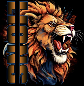
To create some openings in this design, the black portions of the design were knocked out to let the black material of the garment itself show through. Image courtesy of Dane Clement
On the flip side, there are any number of printers out there that you can send your designs to and have your transfers produced. The only equipment you need is a heat press. For those just getting into the business, this might be the best. It gives you a chance to get started with lower out-of-pocket expenses making it easier for you to get off the ground quicker and easier.
If you’ve been in the industry long enough, you know how DTG printing flooded the market in its early years. Everyone had one. Now only those companies that really invested in and took the time to understand the technology remain. Just as DTG boomed, the same might be said for DTF. In time things will likely level out, leaving only those who can afford to maintain and invest in the continued betterment of the process to provide quality transfers. It’s something to consider when trying to decide between doing it yourself or finding a quality supplier who can do it for you.
Just as you need to do your homework when looking into possibly buying equipment, you need to investigate and research the various DTF transfer providers out there. Not all are providers are created equal! You want to go to a trusted business that really knows and understands the product. I suggest sending a design to a few different companies to compare.
Cheapest isn’t always the best. Color quality might be poor. Adhesive may seep out from under the color print leaving an unsightly outline around the printed area. Registration from the colors to the white ink might be out. Some peel hot, while others peel cold, taking longer to get through your job. The transfer might not adhere properly and start to peel. Even ink quality isn’t the same. There are trusted companies that use inks that are certified clean and safe. Others don’t. If you want to grow your business, you need to provide a superior product, and superior products come from trusted, knowledgeable companies. Shop around and talk to others to make sure you’re getting the best product possible.
The DTF race is on, and you don’t want to be left behind. Making sure you create designs properly that work well and then having them produced using quality printers, supplies and products is the way to stay ahead of the crowd!
Dane Clement is president of Great Dane Graphics, as well as vice president of creative for GroupeSTAHL. He has been speaking and writing for the decorated-apparel industry since 1987. He has also authored several artwork-training books for various garment-decoration methods. For more information or to comment on this article, email Dane at [email protected].

