In part 1 of this two-part series on preventing digitizing disasters, we looked at some of the distortion issues machine embroiderers face in general. In part 2 we’ll look at some of the more specific challenges digitizers face, including the creation of accurate lettering and text, underlay issues and density in general. As was the case in the first of these two articles, we will address these problems with a holistic view of embroidery in mind.
Why Lettering Distortion Causes Embroidery Problems
The open areas in lettering, technically called “counters” and “apertures,” must stay open and even for text to remain legible. However, in embroidered letters, these openings can close if they are made too small. When stitching with standard 40wt thread, any opening less than 0.80 to 1.00 mm in diameter is in danger of closing. Slightly altering the letter shape to make the openings larger will keep them from closing or looking pinched.
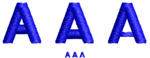
There’s more than one way to digitize the letter “A.” Note how in the middle version the “crossbar” portion has been moved down to make the counter larger while the crossbar in the rightmost letter has been created using a series of manual stitches. Image courtesy of Erich Campbell
An especially problematic letter is the uppercase letter “A.” To open this letter, select and move the “crossbar” portion down to make the counter larger. This will shorten the legs of the letter, but with the natural tendency for satin stitch columns to lengthen, even a low crossbar will usually have sufficient leg length to not make your “A” into a triangle.
If the “A” is small enough, another option is to remove the satin stitch crossbar and replace it with two to four passes of a manual stitch. This will build a roughly 0.80 mm bar, which will be visible while allowing more space in the A’s opening than the usual 1.00 to 1.20 mm satin.

For letters like “P” and “R,” you can similarly drop the bottom half of the “bowl” (the shape that encloses the counter, or “eye,” of the letter) or extend it sideways, making the letter slightly wider. For a lowercase “e,” “a,” or “g,” the trick is to make room in the counter or aperture created by the descender (the element that goes below the baseline on the “g”) or lower arc of the “e.” For the letter “e,” in particular, you may need to drop the central bar and drop the lower arc, or remove some stitches at the end of the arc to open the lower aperture.
Luckily, the eye is forgiving of making rounded characters slightly taller than their neighbors. You may also want to re-center the letter vertically to balance the extra height. For the descender on the “g,” a small drop will be barely noticeable.
How to Prevent Escaped Embroidery Underlays
Commonly seen on an edge run or contour-styled underlays on a satin stitch column, a row of extraneous stitching that looks like a misplaced outline is typically described as an “escaped” underlay. An escaped underlay occurs most often on materials or garments that shift easily and or when the underlay stitching hasn’t been set back far enough from the finished edge. Beyond that, there are two other common situations that may lead to escaped edge runs.
In the first, if the satin stitch is thinner than intended, you may encounter a pull compensation issue, requiring you to increase the automatic pull compensation setting. (Drawing the shape wider in this instance is unlikely to help, as the underlay will maintain the same distance from the finished edge.) In the second, assuming the column or shape is wide enough and/or the edge is where it is intended to be, the problem is likely with the inset distance. The solution is therefore to increase the inset of the underlay to tuck it deeper inside the column.
Note that while it can be tempting to remove the offending underlay, edge-run and contour underlays provide more than just coverage; they also shore up edges to avoid a look of sparseness and “saw-toothing” in satin stitches. This can be especially true along the outside edges of a curve, where density lowers naturally. The additional coverage, or “rail” effect the underlay provides for the top stitching to follow, means removing it can reduce overall stitch quality.
Understanding 2D and 3D Embroidery Density
Density, as we know it from our embroidery software, is the measurement of space between rows of stitching. However, there is more to the concept than this simple definition would suggest.

It’s the interaction between the stitching and underlying fabric that causes the actual embroidery to turn out differently from what you may see on screen. Photo courtesy of Erich Campbell
To start out, we embroiderers are often concerned with the more traditional definition of density as it’s described in software settings. I call this “2D density,” as it’s mostly concerned with providing coverage through the closeness of the lines of stitching.
There’s another way in which density is important, though, and that is in what I call “3D” density. 3D density is similar to 2D density insofar as we are concerned with how close together our stitches are. However, it also considers the fact that we are stitching through our fabric and stabilizer layers, leaving thread in the path of the needle—thread that spreads apart the material through which it is being stitched like a wedge, creating distortion in the underlying fabric. In other words, 3D distortion is more concerned with how close together and how numerous the needle drops are in a given area of your design as opposed to the space between rows of stitching.
In fact, many of the problems embroiderers commonly attribute to excessive density, including knots, breakage and other surface distortions, are more likely the result of an overly tight cluster of needle penetrations than the stacking of more than one layer of stitching.
“Cookie cutter” removal of fill stitching under small, overlying areas of stitching can also lead to aligned edges of fill with areas of extreme 3D density at the same time they increase the number of traveling stitches inflating overall stitch count. A single layer of satin stitches over a fully filled area is rarely problematic. However, even a small number of tiny stitches in a detail-packed 2.00 mm diameter area can become overly dense, creating knots and breakage.
Solving Coverage and Density Challenges
2D Density issue – Sparse Coverage: Sparse coverage happens when we can too easily see the underlying fabric through our embroidery. The usual school of thought for repairing areas of sparse coverage is to add density in the filled area. Unfortunately, while this may be one way to increase coverage, it can lead to increased distortion and thickness, making the embroidered area “bulletproof,” or uncomfortably stiff and heavy for the wearer.
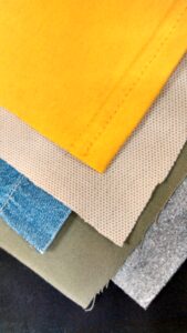
Part of digitizing is understanding how to accommodate the many different types of fabric out there. Photo courtesy of Erich Campbell
Another way to increase coverage is through the use of structural underlays. Underlays can be structural in the sense they create a physical structure on which the top stitching rests, thereby supporting it and creating additional loft, as well as providing additional coverage to the top stitching. To achieve more complete coverage, adding a structural underlay that holds up topstitching is often superior to adding density, as it creates coverage without adding push distortion through additional bulk or creating more needle drops in the densest areas of the topstitching.
For filled areas, underlay can be added automatically or manually and usually consists of a tatami-stitch-filled shape just inside the one you need to support. For best effect, inset the underlay at least 0.40 mm within the edge set with a light-density fill, i.e., one with 30-40 points or 3.00 to 4.00 mm of spacing, on a stitch angle perpendicular to the topstitching with a length of 3.00 to 4.00 mm.
A notable variation on Tatami, or fill underlay, is the double tatami or mesh underlay, a bidirectional underlay that creates a grid-like mesh of loose fills, usually set at 45 and 135 degrees from the stitch angle of the embroidered object. These double diagonal fills provide plenty of color coverage and support, and also tamp down heavy textures under the embroidery object.
3D Density Issues – Dishing and Cupping: If your design area warps, becoming either convex or concave, it’s often due to excessive density packed into a single angle in the filled areas of your design. You will usually notice a “taco” or “potato chip” shape that has its high or low point focused along an axis following the main stitch angle of the largest fill.
To repair design problems like these, back down your top-stitching density, reduce layering if you are shading in the same angle as the primary fill and, where possible, use underlay rather than density to achieve coverage. 40wt thread should rarely have a density higher than 0.40 mm or 4-point spacing.
Managing Detail Beyond Density Settings
Density isn’t simply a setting. When creating detailed outlines and shading, particularly with straight, manual stitches, digitizers can occasionally forget to check how densely they are packing in detail. If you find any areas becoming muddled or becoming fully filled or—worse yet—creating thread breaks, you may have to reduce the amount of detail in an area.
If a space between two lines seems small, measure it in your software. With 40 wt thread, two courses of thread less than about 0.50 mm apart may start to look like a solid fill, as doubled lines need 0.80 mm or more between them to reliably remain separated when stitched. Dense detailed areas can be easily opened up, especially with “engraving” style pieces, by skipping or deleting repeated detail lines to leave gaps sufficient to keep the lines separated.
Sequencing and Pathing for Better Registration
Sequence issues aren’t relegated to just excessive jumps, trims or color changes. Issues like puckering and rippling as well as shifting or poor registration can also come from a poorly thought-out sequence or path through a design.
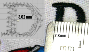
Note how the upper portion of this letter “D” stitches out thinner than as shown on screen as a result of pull compensation. Photo courtesy of Erich Campbell
Sequencing Problems, Poor Registration on Large Designs: Large, detailed designs with outlines that need to register with filled elements can often go off track in stitching. Though this can have to do with difficulties in hooping, if your material is stable and outlines regularly miss in specific areas, sequencing could be the issue. Even with solid hooping, the longer and further away from the initial fills that we stitch before returning to outline areas or draw in details, the more likely we are to see sufficient fabric shifting in the design area to cause registration errors. To repair this issue, you may need to re-sequence a design or split the color stops to allow a particular area of the design to stitch out all colors before moving on.
Pathing Problem, Trapped Ripples: Fabric tends to form a wave at the leading edge of the apparent motion of the stitching in a design. If you stitch “toward” an existing stitched element already fixed to the stabilizer, the wave can “crash,” permanently fixing the wave or ripple.
To avoid these kinds of problems, easily distorted fabrics invariably benefit from the “tablecloth method” of pathing, in which you stitch items near the center first wherever possible and then always stitch “away” from a previously stitched element. Although this can mean extra travel stitches or jumping in the final design, the added stability is more than worth the lost efficiency.
Note: you’ll need to have the actual working file or work with a design file you’ve created on your own in order to be able to employ this method fully, as it means changing the order, and start and stop points in each object, and potentially altering or recreating one or more of the traveling runs between objects.
For extremely unstable garments or to shore up designs for which you don’t have the original file, you may also want to consider adding global supportive underlays manually to secure the fabric to the stabilizer using the tablecloth method, thus smoothing and the design area before topstitching starts.
Understanding How Stitches and Materials Interact
Ultimately, all the things we’ve looked at in these two articles and the interventions we’ve come up with are about the interactions between stitches and materials. When you observe your designs running, pay close attention to fabric structure and the way distortion happens in real time. Same thing with any changes you make to either the files you’ve created yourself or files created by others. Remember the physicality of the thread with which you are stitching and how stitches interact with each other. Remember the way fabric moves and how it reacts to thousands of stitches under tension.
Even when you are on-screen, never forget what happens at the machine. Stay curious, observe carefully and keep in mind what’s going to be happening in the hoop. This is how trial and error becomes an educated guessing game, thereby solidifying our ability to skillfully fix any fault.
Erich Campbell is an award-winning digitizer, embroidery columnist and educator, with more than 20 years of experience. He also is the program manager for the commercial division of BriTon Leap. To reach Erich directly, go to his web site, erichcampbell.com. To see Part 1 of this series, click here.


